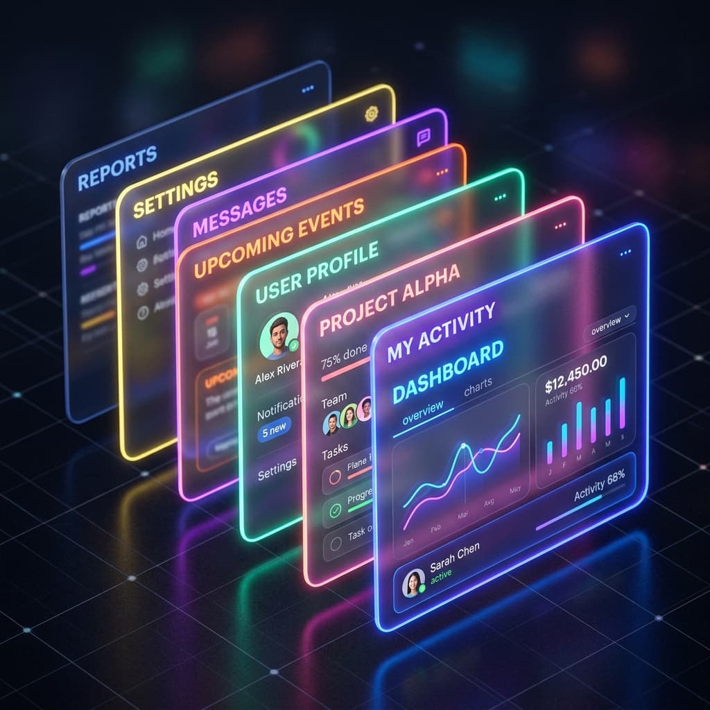
Frosted glass is a beautiful effect, but it's notoriously easy to mess up. True glassmorphism isn't just a semi-transparent background; it's about simulating how light interacts with a physical surface. You need four distinct layers to make it look premium: backdrop blur, surface tint, a subtle border highlight, and a soft shadow.
When done correctly, glassmorphic panels add visual elegance and depth to tool overlays, navigation headers, and modal panels. Let's look at the exact physics and CSS parameters required to achieve the "Apple Look" in modern web browsers.
The Four-Layer Recipe for Digital Glass
1. The Backdrop Blur (Refraction)
The foundation of frosted glass is **Refraction**. The browser distorts the colors of the background elements behind our card. We do this natively in CSS using backdrop-filter. In Tailwind, apply backdrop-blur-md or backdrop-blur-lg.
2. The Surface Tint (Subtle Overlay)
Frosted glass needs a slight color tint. For light mode, use a white tint with very low opacity (5% to 10%). For dark mode, use a black or deep brand tint with 15% opacity. This acts as a physical surface that catches reflections:
bg-white/10 dark:bg-black/15
3. The Catch-Light Border (Tangible Highlight)
This is the secret layer most developers forget. Real glass has visual thickness. When light hits the top edge of a glass pane, it creates a subtle outline highlight. We simulate this by applying a thin, semi-transparent border:
border border-white/20 dark:border-white/10
4. Stacking Soft Shadows (Elevation)
To lift the glass card off the background, pair it with stacked ambient shadows. Avoid single black outlines; use highly diffused, low-opacity shadows that let the background colors show through, creating realistic light diffusion.
Expert Tip
"Glassmorphism only works if there is something colorful behind it. Use vibrant gradients or high-quality photos as your page background to make the 'frosting' effect really pop."