Migrating a legacy codebase to Tailwind v4 can feel like a massive chore. The hard part isn't just swapping out classes; it's shifting your mindset to utility-first styling without losing the unique design details of your product.
We used to have to translate every property by hand, which made migrating large SaaS platforms incredibly expensive. Thankfully, v4's CSS-first @theme engine gives us a much cleaner migration path, bridging the gap between raw CSS variables and utility classes perfectly. Let's walk through a practical, battle-tested migration strategy.
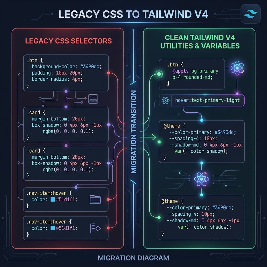
Step 1: Audit and Centralize Global Styles
Before refactoring a single HTML or React file, run a quick audit of your legacy stylesheets. Look for repeating declarations: brand colors, specific margins, border radii, and typographic setups. Instead of trying to translate everything on day one, pull out these core values and declare them inside the @theme block of your main CSS entry point:
@import "tailwindcss";

@theme {
  /* Legacy Color Adaptations */
  --color-legacy-brand:  #1e40af;
  --color-legacy-bg:     #f8fafc;

  /* Layout tokens */
  --radius-legacy-card:  12px;
}
This centralizes your foundations, allowing you to use utility expressions like bg-legacy-brand rounded-legacy-card instantly, keeping styles identical while cleaning up the stylesheet.
Step 2: Using Visual and Automated Converters
For complex layout components (like multi-column grids or navigation menus with absolute positioning), manual translation is a recipe for typos. Using a dedicated converter saves hours of debugging.
A visual converter parses standard CSS rules and outputs clean, modern Tailwind utilities. For example, it translates display: flex; align-items: center; justify-content: space-between; gap: 1rem; into flex items-center justify-between gap-4 on the fly, showing you the layout in real-time so you can verify pixel-accuracy.
Step 3: Refactoring Nested Selectors and Media Queries
Legacy CSS often relies heavily on deep nesting (e.g. .card > .header > h3). In Tailwind v4, we flatten these hierarchies by applying utility classes directly to the target elements. For responsive breakpoints, swap out bulky @media blocks for responsive prefixes: hidden md:block lg:flex. This reduces CSS compilation sizes and makes styling completely modular.
Architect's Tip
"Don't aim for 100% utility coverage on day one. Move your foundations (colors/fonts) to @theme first, then refactor your components one by one using a visual converter to ensure pixel-accuracy."