Honestly, the jump to Tailwind CSS v4 is one of the best things to happen to frontend dev in a while. We are finally moving away from those massive, heavy JavaScript configuration files and returning to where styles belong: CSS-first design.
If you're like me, you've probably spent hours wrestling with tailwind.config.js trying to get custom theme switching or dynamic variables working without breaking your build. In this guide, I'm going to walk you through exactly how I build scalable, modern design systems using v4's native CSS variable engine. No fluff, just practical code and lessons I've learned from building products.
The Big Shift: Ditching JS Configs for Clean CSS
In Tailwind v3 and below, the JS config file was the absolute source of truth. It worked, but in large codebases it easily became a nightmare. You'd constantly context-switch between your CSS files and JavaScript configuration just to add a single shade of gray or a custom breakpoint.
v4 changes the game. By utilizing the new @theme directive, your design system lives directly inside your CSS. The compiler converts your custom tokens into native CSS variables behind the scenes. This means you get instant, zero-runtime theme switching in the browser, which is something that used to require complex CSS-in-JS or weird build hacks.
Key Advantage
"Native CSS variables let you handle theme switching on the fly. You can change your entire brand identity by simply updating a single --color-brand variable on the root element, which makes modern dynamic scaling incredibly smooth."
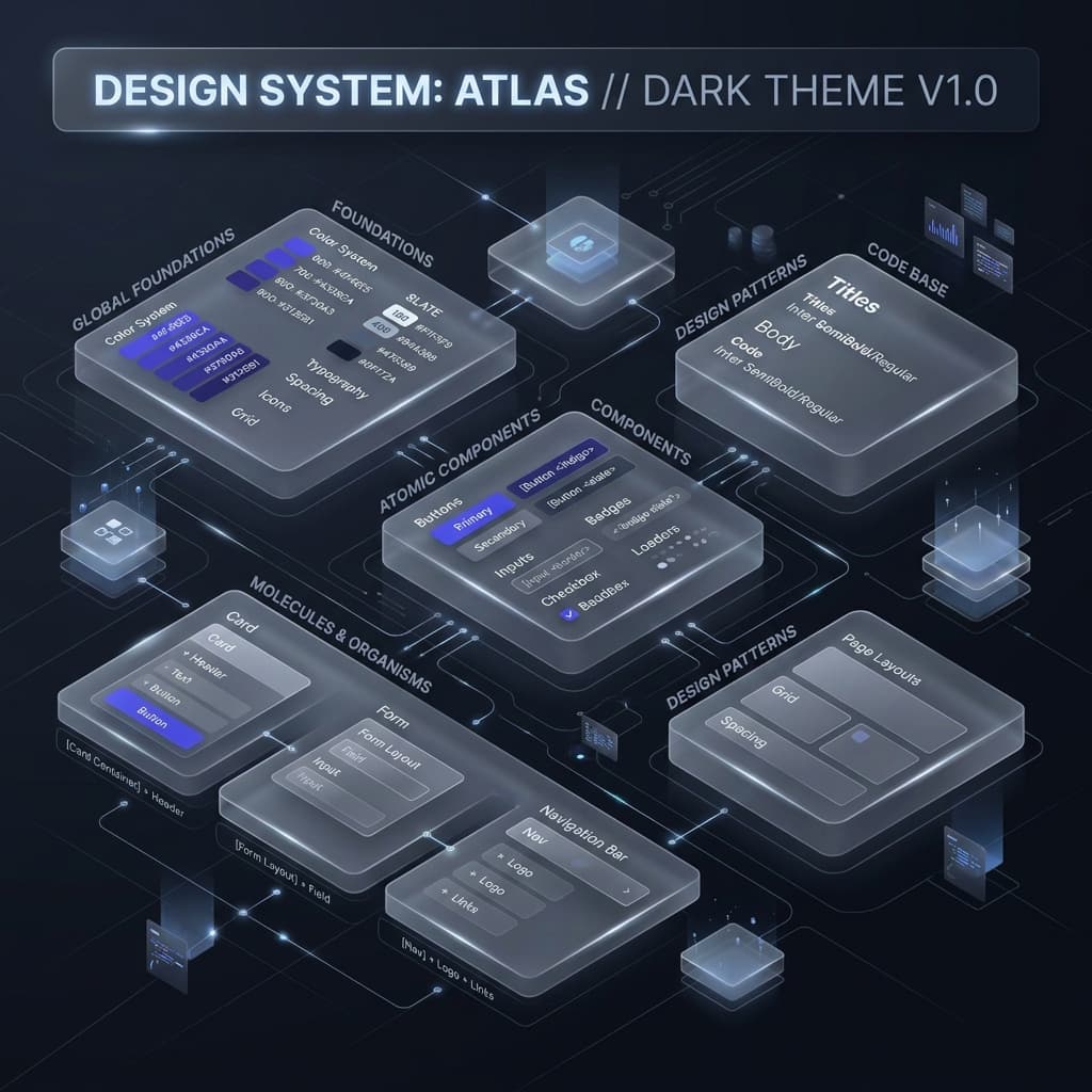
Step 1: Defining the Token Foundations
A design system is only as strong as its smallest foundations. Before styling a single component, you need to map out your primitive tokens. In v4, we write these directly in the @theme block.
1.1 Color Systems (The OKLCH Advantage)
For modern projects, I highly recommend moving away from Hex or HSL in favor of OKLCH. The main issue with HSL is that it isn't perceptually uniform. A bright yellow and a dark blue with the exact same 50% lightness value look completely different to the human eye. OKLCH fixes this, ensuring your color shades progress naturally in brightness.
@theme {
  /* Primitive Tokens */
  --color-blue-50:  oklch(97% 0.01 240);
  --color-blue-500: oklch(60% 0.18 240);
  --color-blue-900: oklch(25% 0.08 240);

  --color-slate-500: oklch(60% 0.02 240);
}
1.2 Spacing and Sizing
Consistency in spacing is what makes a UI feel cohesive and premium. Choose a solid base unit (like 4px or 0.25rem) and scale it up. Tailwind v4 automatically maps spacing variables directly to your utility classes, so p-4 looks up --spacing-4 instantly.
Step 2: Semantic Mapping (Functional Abstraction)
A classic mistake is using primitive tokens directly in your component files, like applying text-blue-500 to all your primary buttons. This is a trap. If your brand color ever changes from blue to purple, you'll have to manually hunt down and replace thousands of classes.
Instead, use Semantic Mapping to tie your specific shades to functional roles.
@theme {
  /* Semantic Tokens */
  --color-brand-primary: var(--color-blue-500);
  --color-text-body:     var(--color-slate-900);
  --color-bg-surface:    var(--color-white);

  /* Action States */
  --color-action-hover:  var(--color-blue-600);
}
By using class tokens like text-brand-primary, you make your codebase future-proof. You can overhaul your entire theme by editing a couple of lines in your central CSS file.
Step 3: Mastering Elevation and Depth
Web interfaces aren't flat. We use visual depth to signal hierarchy. In light mode, we use layered drop shadows; in dark mode, we rely on subtle surface tints.
3.1 The Shadow System
In Tailwind v4, custom shadows should live as CSS variables inside the @theme directive. For a high-end look, ditch single heavy shadows. Instead, stack multiple layers with low opacity to simulate real-world light diffusion.
@theme {
  --shadow-sm: 0 1px 2px 0 rgb(0 0 0 / 0.05);
  --shadow-md: 0 4px 6px -1px rgb(0 0 0 / 0.1), 0 2px 4px -2px rgb(0 0 0 / 0.1);
  --shadow-xl: 0 20px 25px -5px rgb(0 0 0 / 0.1), 0 8px 10px -6px rgb(0 0 0 / 0.1);
}
Step 4: Keeping Contrast Accessible (WCAG 2.1)
A design system that isn't accessible is a major liability. Your color combinations must meet WCAG 2.1 contrast standards - which means a minimum 4.5:1 ratio for normal body text against its background.
Since v4 variables are native browser tokens, you can combine them with CSS color-mix() to generate accessible text variations programmatically, ensuring readability even as themes switch.
Step 5: Why I Built TailwindThemeMaker
Doing the math to generate perfectly balanced 11-step OKLCH scales and checking WCAG contrast combinations by hand is exhausting. While we often try to ask Claude or ChatGPT to write these setups, they constantly hallucinate older syntax, mess up variable naming, or output muddy color ranges.
I built **TailwindThemeMaker** to be a visual sandbox for this exact workflow. It handles the color science, checks contrast compliance, and generates clean v4 variable code in real-time. It's much faster than arguing with a chatbot and trying to debug broken stylesheets by hand.
Architect's Note
"The best design systems are quiet. They don't scream for attention; they provide a consistent, harmonious structure for the user. Spend time solidifying your foundations, and the rest of the UI will practically build itself."
Conclusion: Build for the Long Run
Creating a Tailwind CSS v4 design system isn't a one-time chore; it's about establishing a scalable core for your product. By moving to a CSS-first setup, using semantic variables, and leveraging OKLCH color math, you build a foundation that stays clean and maintainable as your app grows.