Accessibility shouldn't just be a checklist item or a legal requirement. It's literally about making sure anyone can use your site without squinting. If your design system ignores contrast, it's basically broken from day one. Plus, search engines will actively penalize hard-to-read pages, so it hurts your SEO too.
As frontend engineers, we are the gatekeepers of the user interface. Designing a system that excludes a portion of our audience is a massive failure. Let's break down the math and design patterns behind building truly accessible contrast systems.
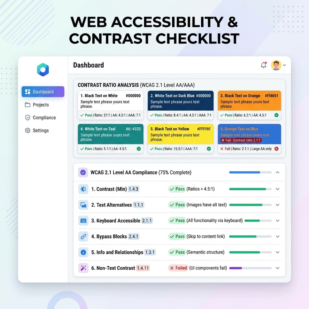
Decoding the WCAG 2.1 Standards
The **Web Content Accessibility Guidelines (WCAG) 2.1** establish clear visual contrast benchmarks to accommodate users with low vision or color blindness:
- WCAG AA Standard (Minimum): Requires a contrast ratio of at least 4.5:1 for normal body text (below 18pt or 14pt bold) and 3.0:1 for large text (above 18pt or 14pt bold).
- WCAG AAA Standard (Enhanced): Raises the bar to a 7.0:1 ratio for normal body text and 4.5:1 for large text. This is highly recommended for documentation and long-form reading platforms.
| Text Type | Standard Size | AA Ratio | AAA Ratio |
|---|---|---|---|
| Normal Text | Below 18pt (24px) or 14pt (18.6px) bold | 4.5:1 | 7.0:1 |
| Large Text | 18pt (24px) or larger, or 14pt (18.6px) bold or larger | 3.0:1 | 4.5:1 |
| UI Components | Active boundaries, focus states, and form inputs | 3.0:1 | N/A |
The Physics of Color Contrast
Contrast is calculated based on **Relative Luminance** ($Y$), which measures how bright a color appears to the human eye. The formula compares the relative luminance of the lighter color ($L_1$) to the darker color ($L_2$):
Contrast Ratio = (L1 + 0.05) / (L2 + 0.05)
Because the human eye is more sensitive to green than to blue or red, HSL and Hex coordinates are highly inaccurate for guessing contrast. A yellow text on white cards might have a high "lightness" value in HSL but terrible readability, while blue text on white remains perfectly readable.
Designing for Color Vision Deficiencies (CVD)
Designing for accessibility goes beyond simple luminance ratios. We must also design for the **8% of men and 0.5% of women** worldwide who experience color blindness. Standard deficiencies modify how colors are synthesized in the brain:
- Deuteranopia (Red-Green Weakness): The most common form of color blindness. Green receptors are absent, making greens, reds, and grays indistinguishable.
- Protanopia (Red-Green Weakness): Red receptors are absent. Red appears dark and muddy, and blends with green.
- Tritanopia (Blue-Yellow Weakness): Rare form. Blue appears green, and yellow appears gray or pink.
The CVD Guideline: Never use color as the *sole* mechanism to communicate status. If a form field is in an error state, do not just change its border from gray to red. A user with Deuteranopia might miss the color shift entirely. Pair color modifications with secondary elements such as **warning icons**, **distinct helper labels**, or **underline style transitions** to guarantee high visual clarity.
Practical Accessible Design Patterns in Tailwind
To keep your design beautiful while remaining compliant:
- Use Badge Overlays: Instead of dark text on dark badges, use heavily desaturated backgrounds paired with bold, highly saturated text (e.g., light green background with dark forest green text).
- Don't Rely Solely on Color: For error states or links, always use visual indicators like underlines or warning icons alongside color changes. A color-blind user may not be able to tell red text from gray text.
- Polished Focus States: Keep your keyboard outline rings visible. Use Tailwind's
focus-visible:ring-2 focus-visible:ring-brandto make navigation seamless for keyboard users.
Advanced CSS Audit Setup
Using the power of Tailwind CSS v4 variables, we can create automatic high-contrast overrides directly inside our theme sheets. When a user toggles high-contrast accessibility mode, we override semantic roles seamlessly:
@theme {
  --color-brand:       hsl(217, 91%, 60%);
  --color-text-body:   hsl(210, 20%, 30%);

  /* High Contrast Accessibility Override */
  @media (prefers-contrast: more) {
    --color-brand:     hsl(217, 100%, 25%);
    --color-text-body: hsl(0, 0%, 0%);
  }
}
Automating Accessibility Checks
Instead of doing the math manually or copy-pasting hex codes into external calculators, I built automated checks right into the **TailwindThemeMaker** canvas. You can see visual contrast tags on the fly, which makes it dead simple to see when a color combo fails the basic 'squint test' before you ship it.