Theme Presets

10 Ready to use

The AI-First Design System
Engine for Tailwind CSS

Generate production-ready Tailwind v4 themes, accessible color scales, and semantic CSS variables in seconds. Built for developers and designers who value speed and design consistency.

Read Design Guides
Natively Supports
Tailwind v4
Next.js
Figma Tokens
Vite
CSS Vars

One Workflow. Zero Friction.

Building a production-ready design system has never been this intuitive.

Step 01

Generate Foundations

Use AI to extract brand colors from a logo or description. Establish your core palette in seconds.

Step 02

Polish Interactions

Fine-tune shadows, animations, and typography using our suite of specialized visual micro-tools.

Step 03

Export & Ship

Copy production-ready Tailwind v4 @theme blocks or CSS variables and paste them into your project.

Next-Gen AI Studio

Design Systems Powered by AI

We've integrated advanced language models to bridge the gap between creative intent and production-ready code.

Prompt-to-Theme Engine

Simply describe your brand's personality or industry. Our AI understands design psychology and generates a complete palette with semantic tokens for backgrounds, borders, and accents.

Instant Brand Extraction

Upload a logo or screenshot, and our engine will instantly extract the dominant brand colors while generating accessibility-compliant supporting shades for your entire UI.

Adaptive Contrast Logic

The AI doesn't just pick colors; it audits them. Every generated theme is automatically adjusted to meet WCAG 2.1 contrast standards, ensuring your product is inclusive from day one.

Intelligent CSS Export

Convert complex design decisions into clean, commented CSS variables or Tailwind v4 theme definitions. Our AI ensures the naming conventions are industry-standard and developer-friendly.

Mathematical Harmony

Our design engine uses advanced color theory algorithms to calculate analogous, triadic, and monochromatic relationships between your primary brand and supporting tokens.

Perceptual Luma Scaling

We don't just shift lightness. We use perceptual color models (OKLCH/HSL) to ensure that your UI elements maintain consistent visual weight across different hues.

Adaptive Dark Mode

The AI intelligently remaps your light-mode surface tokens to accessibility-compliant dark alternatives, preserving your brand identity while protecting user eyesight.

TailwindThemeMaker for whom?

Whether you're a brand owner, developer, or designer, TailwindThemeMaker helps you create stunning color palettes effortlessly.

Brand owners

Find the perfect color palette for your brand

Developers

Get css variables for your projects

Designers

Get the figma tokens, css variables for your next designs

Free Tailwind CSS Theme Generator (v4)

TailwindThemeMaker is a free online tool to generate custom Tailwind CSS themes. You can create, preview, and export global CSS variables for light and dark mode instantly. Perfect for developers who want to quickly build consistent design systems using Tailwind CSS.

How to Generate Tailwind CSS Themes

  1. 1Click the generate button to create a new random theme
  2. 2Preview your theme instantly on the landing page mockup
  3. 3Copy the global CSS variables from the export modal
  4. 4Paste into your Tailwind project's globals.css file

Why Use a Tailwind Theme Generator?

Creating consistent color systems in Tailwind CSS can be time-consuming. This generator helps developers quickly create reusable themes with proper light and dark mode support.

Perfect for:

  • SaaS Dashboards
  • Portfolios
  • Admin Panels
  • Design Systems

This tool helps you avoid manual configuration and speeds up your workflow.

Main Features

Tailwind v4 Setup

Native support for the new @theme block engine.

Global Variables

Exports clean CSS variables for maximum flexibility.

Dark Mode Ready

Automatically generates matching dark mode variants.

Real-time Preview

See your theme on real UI components instantly.

One-click Copy

Get your code ready to paste with a single click.

Premium Design

Modern, professional color palettes out of the box.

Design Tokens

Unlimited

Accessibility

WCAG 2.1

Export Formats

5+

Community

Free

Tailwind v4 Native

Built from the ground up for the new @theme engine. Export clean, modern CSS without the legacy config bloat.

Accessible by Design

Our color math automatically enforces high contrast ratios, ensuring your app is usable by everyone, everywhere.

Semantic Token System

Move beyond hex codes. Use meaningful names like 'brand-default' and 'bg-surface' that adapt to light and dark mode.

Ready to see the full potential?

Explore our high-fidelity design system playground featuring interactive components, dashboard metrics, and modern UX patterns.

Design System Knowledge Base

Build Better UIs with Modern Tailwind CSS

Deep-dive guides on design systems, color science, accessibility, and Tailwind v4 — written for developers who want to do more than just copy-paste.

Design Systems

What is a Design System and Why Does It Matter?

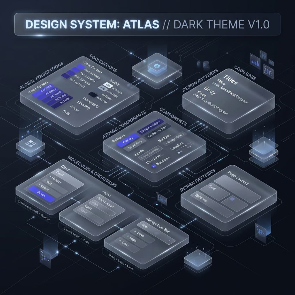
A design system is a single source of truth for your product's visual language — a structured collection of reusable components, style guidelines, and design tokens that ensure every part of your UI looks and behaves consistently. Without one, even small teams end up with mismatched font sizes, inconsistent button colors, and subtle visual debt that accumulates over time.

Modern design systems go beyond styleguides. They define semantic tokens like "bg-surface", "text-muted", and "border-strong" so that the intent of a color is clear, not just its hex value. This semantic layer makes dark mode effortless, theme switching instant, and onboarding new developers dramatically faster.

Read the Docs
Tailwind CSS v4

Understanding the Tailwind CSS v4 @theme Block

Tailwind CSS v4 introduces a revolutionary change to how you define your design tokens. Instead of a JavaScript config file, your entire design system lives in CSS — directly in your globals.css using a new @theme directive.

This means your tokens become standard CSS custom properties, readable by the browser natively. You can use them in vanilla CSS, React inline styles, and Tailwind utilities simultaneously. Variables like --color-brand and --spacing-lg are automatically mapped to Tailwind utility classes like bg-brand and p-lg, eliminating the need for a build step to update your theme.

This also unlocks true runtime theme switching — toggle a .dark class on your <html> element and every token updates instantly, with zero JavaScript required.

Try Config Converter
Color Science

Why Perceptual Color Models (OKLCH) Beat Hex Codes

Most developers define colors using hex codes like #3b82f6. While convenient, hex codes operate in the sRGB color space — a space that is not perceptually uniform. This means that two colors with the same mathematical "distance" can look drastically different in terms of perceived brightness.

OKLCH (Oklch Lightness Chroma Hue) is a modern color model designed to be perceptually uniform. When you create a 10-step color scale in OKLCH, each step feels visually equidistant from the next. The result is a palette that looks professionally designed rather than mathematically generated.

Tailwind CSS v4 natively supports OKLCH values in the @theme block, making this the ideal time to upgrade your color strategy from hex codes to a science-backed system.

Generate a Color Scale
Dark Mode

The Right Way to Implement Dark Mode with CSS Variables

Dark mode is frequently implemented incorrectly — usually by maintaining two separate stylesheets or by conditionally swapping hardcoded color values in JavaScript. Both approaches are fragile, slow, and hard to maintain.

The correct approach uses CSS custom properties with a .dark class override. Your :root block defines the light-mode values, and a .dark { ... } block redefines the same variable names with dark-mode-appropriate values. Tailwind CSS v4's @theme block integrates perfectly with this pattern.

For shadows specifically, this pattern is even more critical. A box-shadow with a hardcoded rgba(0,0,0,0.1) will be invisible on a dark background. Our Box Shadow Generator now outputs fully structured dark-mode-ready shadow code: your shadow geometry uses var(--shadow-color-1) tokens whose values shift between :root and .dark automatically.

Accessibility

WCAG Contrast Ratios: The Developer's Practical Guide

The Web Content Accessibility Guidelines (WCAG) define minimum contrast ratios between text and its background to ensure readability for users with low vision. The standard has two levels: AA (minimum, 4.5:1 for normal text) and AAA (enhanced, 7:1 for normal text).

In practice, this means you cannot use a light gray text on a white background and call it accessible. Many design tools show you a "contrast ratio" badge but don't enforce it. Our theme generator calculates WCAG contrast for every token pair automatically and warns you when generated colors fall below AA compliance.

When you use our Color Shade Generator to build a custom palette, each generated shade is tested against both pure white and pure black backgrounds, so you know exactly which steps in your scale are safe to use for body text, placeholder text, or interactive controls.

CSS Architecture

CSS Variables vs. Tailwind Arbitrary Values: When to Use Each

Tailwind's arbitrary value syntax — like shadow-[0_10px_20px_rgba(0,0,0,0.1)] — is powerful for one-off values but can quickly pollute your codebase if overused. Every arbitrary value creates a unique CSS class that can't be reused or themed.

CSS custom properties (variables) solve this by centralizing your design decisions. Define --shadow-card once in your @theme block, and use shadow-card everywhere. When you need to update the shadow, you change one line — not dozens of component files.

The practical rule is: use Tailwind's standard scale for 80% of your work, arbitrary values for genuinely unique one-off cases, and CSS variables for any value that appears in more than one place or needs to respond to theming.

Try Box Shadow Generator
Migration

Migrating from Tailwind v3 to v4: What Actually Changes

Tailwind CSS v4 is not a simple patch — it represents a fundamental architectural shift. Here is what changes in practice:

1. Config file → CSS file. Your tailwind.config.js is replaced by a @theme block in your CSS. Our Config Converter tool handles this automatically.

2. JIT by default. The new engine is dramatically faster and doesn't require safelisting or purging configuration.

3. New utility names. Some utilities were renamed (e.g., shadow-sm values changed). The CSS → Tailwind Converter helps you identify and update these.

4. CSS Layers. Tailwind v4 uses native CSS @layer for better specificity control, meaning your custom CSS has cleaner interaction with Tailwind utilities.

The good news: most of your HTML class names remain unchanged. The migration is primarily a configuration and tooling update, not a component rewrite.

Migrate Your Config

Quick Design System Insights

Use Semantic Token Names

Name tokens by their purpose (bg-surface, text-muted) not their value (gray-100). This makes dark mode trivial and component code self-documenting.

Build Scale Before Components

Define your color scale, type scale, and spacing scale first. Components built on top of a solid scale are consistent by default, not by coincidence.

Test Contrast Early

Check WCAG contrast ratios during palette definition, not after. Retrofitting an inaccessible color palette is far more expensive than getting it right from the start.

Design in Both Modes

Always preview your UI in both light and dark mode before shipping. Shadows, borders, and glass effects behave very differently depending on background luminance.

Ready to apply this knowledge?

All the concepts above are built into our tools. Generate color scales using OKLCH, export dark-mode-ready shadows, and convert your Tailwind v3 config — all for free.

Common Questions

Everything you need to know

New to Tailwind v4 or design systems? We've got you covered with these quick answers.

Simply use the sidebar to choose your primary and secondary colors, or hit the 'Generate' button for a random professional palette. Once you're happy with the look in the live preview, click 'Export CSS' to get the code for your Tailwind v4 project.