You've probably heard of the 60-30-10 rule from interior designers, and it translates perfectly to web interfaces. 60% of your screen should be a neutral base, 30% goes to secondary elements, and just 10% should be your accent color. This simple balance prevents your site from looking chaotic.
But how do you pick that secondary color? Many developers just slide their color picker randomly and end up with mismatched tones that clash. Let's explore the science of color wheels and mathematical relationships to build stunning secondary palettes.
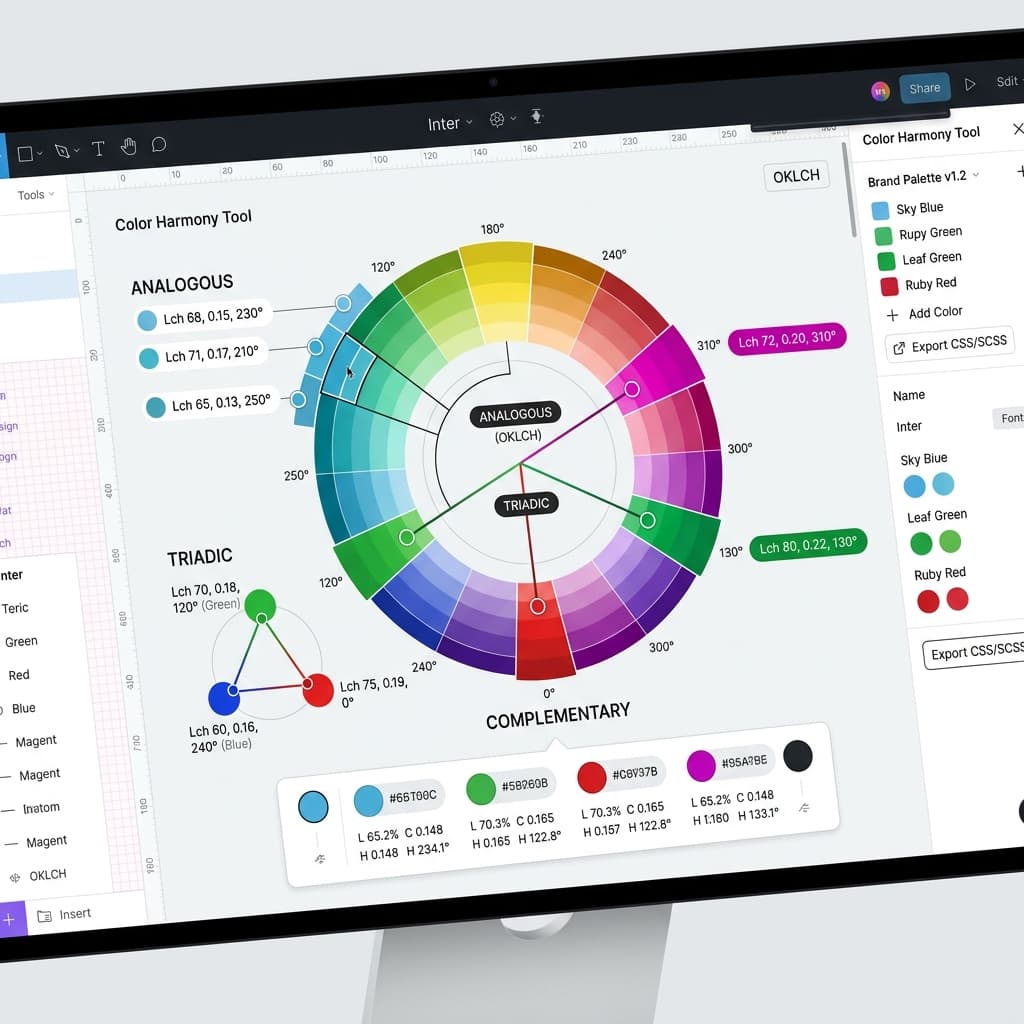
1. Analogous Palettes (Calm and Unified)
Analogous colors sit next to each other on the color wheel. If your primary brand color is a cool blue, pairing it with analogous cyan or deep indigo accents makes your interface feel incredibly cohesive, natural, and calm. This is an excellent choice for developer dashboards and tools that require high concentration.
2. Complementary Palettes (High Contrast & Energy)
Complementary colors sit directly opposite each other on the color wheel. A sharp, warm orange accent against a cool blue background immediately creates intense visual contrast. Because our eyes are drawn to this contrast, it works perfectly for highlight markers, call-to-actions, and conversion buttons. Use it sparingly to avoid visual noise.
3. Triadic Palettes (Balanced & Saturated)
Triadic colors are three colors spaced evenly around the color wheel, forming an equilateral triangle (e.g. blue, red, and yellow). This creates a very vibrant, energetic vibe. Triadic schemes are excellent for creative apps, portfolios, and children's education platforms. Keep the saturation balanced so they don't fight for attention.
/* Mathematical HSL Offsets */
--color-brand:      hsl(210, 100%, 50%); /* Blue Anchor */
--color-analogous:  hsl(240, 100%, 50%); /* Indigo (+30° Hue Offset) */
--color-complement: hsl(30, 100%, 50%);  /* Orange (+180° Hue Offset) */
By using mathematical hue offsets, you remove the guesswork. You can construct secondary palettes that look like they were styled by a senior designer on the first try.