Ever wonder why almost every SaaS product, bank, and dashboard you use is some shade of blue? It's not a coincidence. Color acts as a direct line of communication to our brains, evoking emotional responses long before a user has read a single headline.
As designers and developers, choosing a color scheme is about establishing the exact **vibe and trust factor** for your product. Let's break down the psychological profiles of primary hues and how to apply them to modern software.
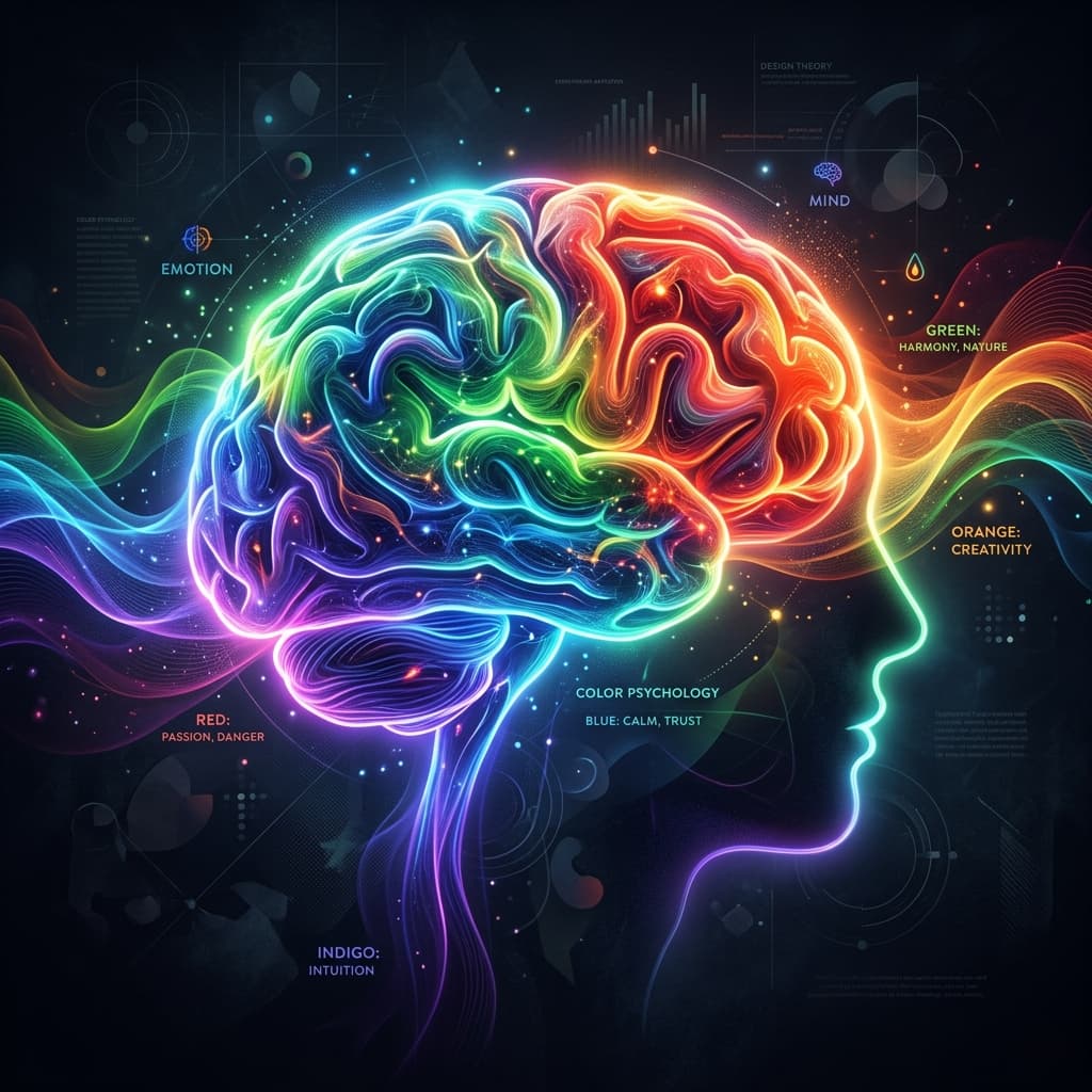
Blue: The Anchor of Trust and Security
Blue naturally feels stable, reliable, and professional. It slows the heart rate and creates a sense of calm. If you're building a dashboard, financial application, or database console where users deal with sensitive information, blue is almost always the safest choice to build trust and authority.
Green: Growth, Vitality, and Success
Green is the color of nature, representing growth, fresh starts, and positive confirmation. In UI design, green acts as the ultimate validation color. Think about checkout buttons, success alerts, or financial apps displaying high-growth stock charts. It's a great choice if your brand is associated with health, money, or green technology.
Red: Energy, Urgency, and Caution
Red is a high-contrast, high-impact color. It commands attention and triggers a physiological response that increases heart rate and excitement. In software, red is the warning siren: reserved for delete buttons, critical errors, and flash alerts. Use it sparingly like a powerful spice, or you will create intense visual anxiety for your users.
Yellow & Orange: Friendliness and Creativity
Yellow and orange project warmth, energy, and approachability. They represent creativity and optimism. Modern developer platforms and community portals (like Lemon Squeezy or Hacker News) often use warm orange accents to feel friendly and community-oriented. Keep the saturation in check to prevent these colors from looking cheap.
Purple & Indigo: Luxury and Innovation
Historically associated with royalty, purple and indigo represent premium quality, luxury, and high-end tech innovation. If you are building a cutting-edge AI startup or a design-first SaaS tool (like Linear or Stripe), indigo tones evoke a premium, sophisticated aesthetic that sets you apart from corporate competitors.
Designer's Guideline
"Don't pick your primary color because you personally like it. Pick it because it matches the emotional state your user needs to be in when using your application."