Honestly, we are living in the golden age of CSS. Features that used to require heavy JavaScript plugins or complex post-processors are finally landing natively in the browser. Let's explore the core specs reshaping web layouts and how Tailwind v4 is evolving to support them.
1. Container Queries: Component-Level Media Queries
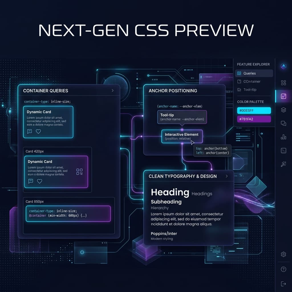
Container queries are the biggest shift in layout since CSS Grid. Traditionally, media queries look at the width of the whole screen. This is problematic if you're building reusable component cards that can live in a wide main section or a narrow sidebar.
Container queries solve this by letting components adapt to the width of their **parent container** rather than the screen viewport. Tailwind v4 introduces native container query classes: @container on the parent, and @lg:grid-cols-3 on the children. This makes building modular, drop-in components incredibly clean.
2. Anchor Positioning: Ditching Heavy JS for Tooltips
Positioning popovers, dropdowns, and tooltips accurately relative to a button used to require massive JavaScript positioning engines like Popper or Floating UI. The new CSS Anchor Positioning API lets you anchor overlays natively in CSS, eliminating layout-calculation script lag entirely.
3. The Move Away from Raw AI Prompting for UI
I really think the era of trying to "guess" UI through raw AI prompt boxes is fading. Asking an LLM to generate a complex box shadow or an accessibility-compliant palette usually just burns tokens and leaves you with half-broken, hallucinated code.
The future belongs to tools that combine visual precision with framework-specific output. By using dedicated visual generators for spacing, shadows, and animations, you get the absolute best of both worlds: mathematical accuracy on the first try, with zero wasted time.