Neumorphism is a super interesting aesthetic that simulates tactile, soft elements that look like they're extruded from or pressed into the background. Unlike standard flat designs, it focuses on simulating physical surface tension.
While neumorphic designs look extremely sleek, they present serious usability challenges. Let's talk about the shadow math behind Soft UI and how to maintain high legibility and usability for all users.
The Shadow Math behind Neumorphic Depth
Neumorphism relies on a flat base color. The extruded illusion is created by offsetting **two distinct shadows** on opposite corners to simulate light hitting a soft surface at an angle:
- Top-Left Shadow (Highlight): A bright, white shadow representing light reflection.
- Bottom-Right Shadow (Ambient): A darker, muted gray shadow representing light occlusion.
/* Neumorphic Extruded Shadow Setup */
--shadow-soft-out:
  -8px -8px 16px rgba(255, 255, 255, 0.8), /* Light Top-Left */
  8px 8px 16px rgba(0, 0, 0, 0.05);       /* Dark Bottom-Right */
The Critical Accessibility Trap
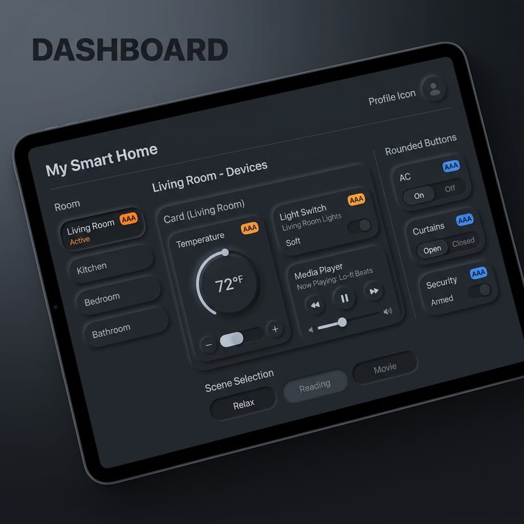
Because neumorphic elements share the exact same background color as the parent surface, their boundaries are defined **only by subtle shadows**. For users with visual impairments or on low-contrast screens, these boundaries are completely invisible, making forms, buttons, and switches unusable.
How to Make Neumorphism Accessible:
- Never Rely on Shadow Alone for Buttons: Always pair neumorphic card backgrounds with bold text, prominent icons, or high-contrast border outlines.
- Active Indicators: For switches or toggles, add a bright, high-contrast brand accent dot or color overlay to signal active states clearly.
- High Vertical Contrast: Ensure body text contrast hits a minimum of 4.5:1 ratio against the neumorphic surface.