The launch of Tailwind CSS v4 represents a major shift away from bulky JavaScript config files and toward a native, CSS-first architecture. It's a great evolution, but it does mean the math behind theme configuration is now a bit more complex.
Building a theme that looks professional and scales well requires a solid approach. In this guide, I'll walk you through how to use modern theme generators to build a rock-solid design system that works just as well for a quick side project as it does for a massive production app.
The New Paradigm: Variable-First Thinking
In the past, Tailwind themes were essentially static JS objects. With v4, they are dynamic trees of CSS variables mapped inside the @theme block. This lets you write clean CSS variables that instantly connect to utility classes behind the scenes.
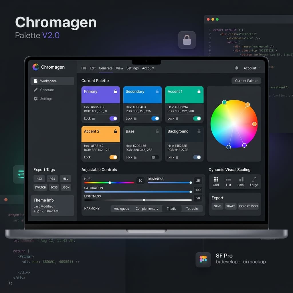
But let's be honest: writing out dozens of CSS variables for color scales, spacing, and shadows by hand is incredibly tedious and prone to annoying typos. A single mismatched bracket can break your whole UI. That's why having a visual tool is a lifesaver.
Step 1: Establishing the Brand Anchor with OKLCH
Your brand anchor is the starting point for everything. In Tailwind v4, I highly recommend using the OKLCH color space instead of traditional Hex or HSL formats.
Why OKLCH? OKLCH is perceptually uniform. This means that if a blue and a yellow color share the same lightness value, they actually look equally bright to the human eye. This is crucial for keeping visual weight consistent across your interface.
Pro Tip
"When picking your Brand Anchor, don't just think about the color. Pay attention to the Chroma (C). High-chroma colors are hyper-vibrant, while lower chroma values look clean and corporate."
Step 2: Generating Functional 11-Step Scales
You can't build a great UI with just a single brand color; you need a cohesive scale. Usually, this means an 11-step range from 50 to 950. The real challenge is making sure your colors progress naturally in lightness without shifting hues.
The Role of the Generator:
A good generator uses perceptual math to interpolate shades, so your "Blue-500" stays true blue all the way down to "Blue-900", instead of randomly shifting toward purple or green - which is exactly what happens with manual color pickers.
- Shades 50-200: Reserved for backgrounds, subtle surface fills, and disabled states.
- Shades 300-500: Your primary brand colors. Used for buttons, active links, and prominent badges.
- Shades 600-950: High-contrast variations used for body text, headers, and iconography.
Step 3: Mastering the Shadow System
Shadows are the secret sauce of visual depth. In v4, you should define these directly inside the @theme block as CSS variables.
For a really polished look, ditch simple single-layer shadows. Instead, stack 2 or 3 layers with low opacity and high blur. This simulates real-world lighting - a sharp inner edge paired with a soft, ambient glow that feels incredibly premium.
@theme {
  --shadow-card:
    0 1px 3px 0 rgb(0 0 0 / 0.1),
    0 1px 2px -1px rgb(0 0 0 / 0.1),
    0 10px 15px -3px var(--color-brand-subtle);
}
Step 4: Semantic Mapping (Functional Abstraction)
The final piece of the puzzle is semantic mapping. Avoid using hardcoded color shades like blue-500 directly in your component files. Map them to functional roles instead.
If your brand color changes, you only want to update a single line in your theme file, not search-and-replace a thousand component files. This simple abstraction is what separates messy side-projects from production-ready systems.
@theme {
  /* Mapping primitives to semantics */
  --color-action-primary: var(--color-brand-500);
  --color-border-subtle:  var(--color-slate-200);
  --color-text-heading:    var(--color-slate-950);
}
Step 5: Why AI Alone is Not a Design System
It's super tempting to just ask a chatbot to generate a Tailwind v4 theme. But LLMs are notorious for spitting out invalid variables, broken syntax, or color scales that look muddy. You waste a ton of time and tokens just trying to debug the output.
That's why I built TailwindThemeMaker. It gives you deterministic, mathematically perfect CSS variables on the first try. It handles the color science and syntax validation behind the scenes, so you can spend your time building features instead of tweaking CSS configuration.
Technical Insight
"The most scalable design system is the one that's easiest to use. Set up clear semantic rules in your stylesheet, and your team will write clean code naturally."
Conclusion: Design is a System, Not an Accident
A professional UI is built on a foundation of mathematical harmony and technical precision. By utilizing the Tailwind CSS v4 @theme engine and a dedicated visual builder, you transform your CSS from a collection of "hacks" into a robust, scalable system that empowers your team and delights your users.